Responsive design is a web design technique that allows a website's layout and content to respond (or, adapt) based on the size of the screen it’s presented on. Whether being viewed on a desktop computer or one of the hundreds of mobile devices the website will automatically change to fit the device it is being viewed on.
What's So Important About Responsive Design?
Before the days of responsive design, developers would have to test out each new website on a variety of computers and devices. This would include a laptop or desktop, a tablet, and at least one smartphone. Of course, just testing on one of each device is not enough to ensure the site works well on all devices on the market.
For example, not all smartphones have the same screen size or even the same operating system. This makes the testing process time consuming. In fact, according to the Responsive Web Design site, the rate at which new devices are being released these days makes it impossible to test each website on every laptop, tablet, or phone. That's why it is necessary to have a website that is intuitive enough to adapt to each type of device so that any of your website visitors will have the best experience you can provide them.
What Are the Distinguishing Features of This Design Type?
If you still can't gbet your head around responsive design, you should learn some of the main features that set it apart from traditional web design. Once you have some understanding of its concrete benefits, you will see how useful this responsive design is.
Layout and Screen Size
Some of the most noticeable examples include the layout and size of the site, both of which change depending on the device you are using. When you are on a smartphone, the site will adapt to fit your screen, which might mean changing the layout a bit so the menu drops down. But when you are on a desktop or laptop, that same site will fill up your larger screen, in which case the menu should switch from dropdown to full size. Even the orientation and resolution of your device will be taken into consideration before the website is portrayed on the screen.
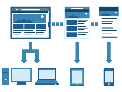
Content
Due to these changes, the amount of website content you see depends on the device you use. You can expect to see the full amount of content when there is more room on the screen, such as on a desktop. But on a mobile device, there is less room to display content, which means you will have to click links to read more. The result is less pinching, zooming, and scrolling to get around websites on smaller devices, which benefits both readers and website owners.
Search Engine Optimization
Responsive design even has an effect on search engine optimization. This is big!. After all, without responsive web design, many businesses would simply have a mobile site and a non-mobile version. If both websites were to have the same content, the business would be penalized by Google, requiring business owners to have different content written for each site. With the advent of responsive design, this is no longer a problem. Plus, when the Google bot can crawl your website with ease like it can with responsive design, you have a good chance of performing better when it comes to SEO. The Google bots can actually detect if a site is mobile optiized and it will give it proprity when delivering search results to someone who is searching from a mobile device.
With these features, it's no wonder responsive design is considered so beneficial. In fact, research shows that responsive websites often have lower bounce rates, increased conversions, and an overall stronger web presence. And of course, users benefit from a more holistic web browsing experience, which has led to the increased popularity of responsive design.
Sources:
http://responsivedesign.ca/blog/responsive-web-design-what-is-it-and-why-should-i-care
Share this

3 Common Challenges of Responsive Design